— CONCEPT · SELF-INITIATED BRAND WORLD · COFFEE —

THE
UPPER
CUP

THE
UPPER
CUP

THE
UPPER
CUP

A neighborhood coffee brand rooted in Columbus, where every roast has a sense of place and the counter is where connection happens.

A neighborhood coffee brand rooted in Columbus, where every roast has a sense of place and the counter is where connection happens.

● CONCEPT STUDY · IMAGINE REIGN CREATIVE STUDIOS ●

01 The Idea

01 The Idea

What if a coffee brand was specific to its streets instead of generically artisanal? Upper Cup is a concept brand world for a Columbus neighborhood roaster — identity, packaging, café environment, and a site — built on the idea that the strongest coffee brand isn’t a taste note, it’s an address.

“Third wave” made coffee precise. This one makes it local again.

TYPE

Concept Brand + Experience

STUDIO

Imagine Reign Creative Studios

SCOPE

Brand Strategy · Identity · Environment · Packaging

COMPANION

Café Environment

REFERENCE

Columbus, Ohio · Olde Towne East

02 The Re-Brand

02 The Re-Brand

A FRESH LOOK. THE SAME COMMUNITY SPIRIT.


Upper Cup’s rebrand builds on what makes the café meaningful: thoughtfully roasted coffee, familiar faces, and connections formed over a shared cup. The new identity brings that welcoming spirit into a bolder visual expression, creating a consistent experience across the café, packaging, merchandise, and mobile coffee service.

A FRESH LOOK.

THE SAME COMMUNITY SPIRIT.


Upper Cup’s rebrand builds on what makes the café meaningful: thoughtfully roasted coffee, familiar faces, and connections formed over a shared cup. The new identity brings that welcoming spirit into a bolder visual expression, creating a consistent experience across the café, packaging, merchandise, and mobile coffee service.

BEFORE

The original logo introduced a playful personality through expressive lettering, eye details, and a light blue cup.

AFTER

The new design carries that character forward with subtle facial marks, a warmly illustrated cup, and golden rays that give “Get Lifted” a visual expression.

03 The New Brand

03 The New Brand

PALETTE

First Pour

#28110D

Sophistication and contrast. The reversal ground, the signage, the counter face. Deep enough to make the cream read as light rather than beige.

Copper Kettle

#C16328

Energy and recognition. The signature accent, checkerboard, floral tile, saucer, campaign. This is the color you’d spot from across the street.

Golden Crema

#CF9D2E

The lift. Reserved for the rays above the cup and for moments of arrival — “your cup is up”, rewards, the end card.


Sunday Sage

#667052

A muted olive green that brings earthy warmth and the calm of a slow Sunday morning.


Coffeehouse Clay

#947B68

Comfort and simplicity. The ground everything sits on, warm enough that paper cups and kraft bags look intentional rather than cheap.

Morning Mist

#9DB9B8 — Sage, the cooling secondary


A soft blue-green that captures the quiet freshness of an early morning.

Oak Milk

#EBE1C8 — Paper, the digital ground

A warm, creamy neutral that brings comforting softness to every touchpoint.

TYPOGRAPHY

PRIMARY FONT

bodoni moda black — headlines, cup messages, campaign

SECONDARY FONT

made tommy uppercase — moments of arrival and warmth

body font

made tommy — menus, digital, informational copy

ACCENT FONT

BASSY — menus, digital, informational copy

ALTERNATE ACCENT

bodoni moda semibold italic — menus, digital, informational copy

Utility

ORDER 0412 · SHELF 2 · EST 2010

DM Mono — order codes, labels, wayfinding, price rails

ICON SYSTEM

04 Six Roasts

04 Six Roasts

ROASTED BY US. BREWED FOR YOU.


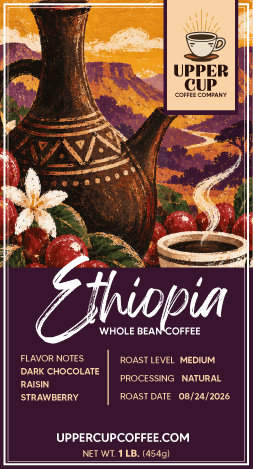
At Upper Cup, we roast our own coffee with care, bringing out the distinct character of every batch. Explore six signature selections: Colombia, Guatemala, Espresso, Costa Rica, Ethiopia, and Brazil and find the flavor that lifts your daily ritual.

05 The Café

05 The Café

ENVIRONMENT
THE COUNTER IS THE BRAND
Menu boards, signage, and wayfinding designed as one typographic system — the room reads as legibly as the bag.

06 Inside the World

06 Inside the World

07 Beyond the Counter

07 Beyond the Counter

COMPANION · ENVIRONMENT
THE CAFÉ KIT
A full environmental design package — menu boards, wall type, wayfinding, and merchandise specified as a system any new location could open with.

The Ellington Hotel →

The Ellington Hotel →

The Ellington Hotel →